12 Stylish Loos
A collection of bathrooms, from tiny to regal
Consider this a game of thrones. Take a look at a diverse collection of 12 stylish loos, from tiny to regal, plus tips for every bathroom from the pros.

Photo by Emily Minton Redfield
1. SUITE REVISION
Designer Jonna Mulqueen persuaded her Cherry Hills Village clients to turn their large attic space into a master suite. “It took a little convincing,” she says of the renovation that became a dream space, complete with this 350-square-foot bath. Mulqueen selected large-scale, polished Calacatta Gold marble floor tiles. “I spent hours laying out each piece, until the veining pattern sang back to me.” The shower’s Moroccan ceramic tiles by Waterworks echo the room’s warm paint color, while the brass fixtures provide a modern edge.
The brass finishes—on lighting, faucets, mirrors—congregate at a pair of Caesarstone-topped custom vanities (the second reflected in the mirror) that flank the room. “We wanted them to look like furniture—but a little more refined than actually retrofitting a furniture piece,” cabinet designer Brett La Hay says. The finishes—a white-painted frame and drawers, and gray-stained ripped-oak drawer insets—elevate the piece and add a lightness to each seven-drawer unit. The once-attic now mirrors the homeowners, Mulqueen says. “He is a true rock ’n’ roller, and she is a refined beauty who gravitates toward timeless design and clean lines.”
PRO TIP: “Before you design anything, really take inventory of what you need to store. If you don’t have room for your hair dryer or towels, a pretty design won’t work for you.” — Cabinet Designer Brett La Hay
DESIGNER Jonna Mulqueen, Uncommon Nest Interiors BUILDER K.C. Jones, Cornerstone Custom Homes CUSTOM CABINETRY Brett La Hay, Kitchen Distributors

Photo by Susie Brenner
2. CONTRASTINGLY BRILLIANT
When it came to their Littleton office remodel, Duet Design Group used the opportunity to put their talents on display. “We took the building to the studs,” designer Miranda Cullen says. Next, they selected and designed all the materials to create a setting where clients can envision what’s possible. “The space is very eclectic, with an industrial base—think exposed beams, concrete floors. It made sense to go a bit more bold in the bathroom,” Cullen says. To that end, the designers chose tile flooring in a graphic pattern: Waltham Elyptic Diamond by Unique Building Concepts. One wall takes subway tile (Sensai in Silver by Solistone Commercial) on a modern, monotone ride by installing it vertically with matching grout. The other walls display Grafitto wallpaper in Sand/Black by Groundworks.
Drama and glamour saunter into the space with a wide, floating sink and a mirror that calls to mind a ruffled petticoat, accessorized with a mix of brass and bronze finishes. “Sophisticated doesn’t have to mean boring,” Cullen says. Designer Devon Tobin adds, “We love how the patterns and textures play so well together in this space.”
PRO TIP: “Our no-fail paint color: Benjamin Moore’s Revere Pewter.” — Designers Devon Tobin and Miranda Cullen
DESIGNER Duet Design Group

Photo by David Patterson
3. DARK & SULTRY
“I wanted to create a jewel box,” designer Carolyn Morris says of this 1970s Cherry Hills home’s powder room. Before the remodel, she says, the house “didn’t have a real distinct architectural style.” Morris, with homeowner Anuschka Pashel and architect Carlos Alvarez, gutted the interior and created a traditional European feel, with a lot of trim and detail.
The 8-by-8-foot bath is cocooned in deep-charcoal gray. Classical molding frames mirrored panels on walls that cradle a custom, unlacquered brass vanity, topped with a Nero Marquina marble slab and Waterworks’ Henry faucet, also in unlacquered brass that patinates with every touch. The floor is dressed in encaustic cement tiles—a Euro design classic—in an Old World pattern modernized by a rich custom-color scheme. “The charcoal and gold tones bring out the color of the brass,” Morris says. The room’s lighting—Liaison Double Arm Sconces and Strada Flush Mount by Kelly Wearstler for Visual Comfort—are modern shapes formed in timeless brass.
That dramatic backdrop brings the room’s art—a piece from homeowner Pashel’s collection—to the forefront. “It was important to add a large art piece that is light in color,” Morris says. “This one’s amber tone is warm and echoes the brass elements.”
PRO TIP: “Don’t be afraid of a black room, but really think about what you will put on the walls.” — Designer Carolyn Morris
DESIGNER Anuschka Pashel, Bloom DESIGNER Carolyn Morris, Alvarez Morris ARCHITECT Carlos Alvarez, Alvarez Morris

Photo by Emily Minton Redfield
4. OLD HOLLYWOOD
“Local folklore attributes our 1952 Cherry Hills Village home to being originally built for Hollywood star Ethel Merman,” architect and interior designer Jim Taylor says. He partnered with builder Jeremy Larson and dear friend and designer Lu Law to make his pool cabana and its 50-square-foot bath an homage to Hollywood Regency style and The Beverly Hills Hotel. “The concept was to evoke a feeling of living on vacation in a grand hotel,” he says. “The wallpaper is the original design called Martinique and is still produced by Designer Wall Coverings.” Nero Marquina marble forms the wainscoting and pairs with Carrara marble to make up the checkerboard floor. Jim sourced period furniture from Circa Who in West Palm Beach, Florida. The mirror is a refurbished, vintage Gampel-Stoll piece. The vanity was formerly a bedside table. Jonathan Adler lighting is period-inspired, as are the satin bronze fixtures by California Faucets. Law offers that her role “was making sure it wasn’t too over the top.” She says, “We came right to the edge, but not over.”
PRO TIP: “I never say ‘never.’ Ever. People used to say that about bronze! Or mixed metals! There’s never a ‘never’ in design.” — Designer Lu Law
DESIGNER Jim Taylor, Site 7 Solutions DESIGNER Lu Law, Lu Bolognue Studio BUILDER Jeremy Larson, Montare Builders

Photo by Kimberly Gavin
5. MOUNTAIN SOPHISTICATE
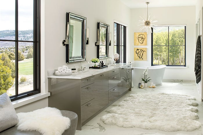
Views of the surrounding Red Sky Ranch landscape abound in a window-wrapped master bathroom in Wolcott, down-valley from Beaver Creek and Vail. “We wanted to make a classic, natural statement that wouldn’t compete with the views and natural light,” designer and homeowner Julie Roitman says. In the 500-square-foot bath, walls painted Benjamin Moore’s Simply White fade away, while dark-trimmed windows frame the views. “I like to keep the walls simple and let them serve as a backdrop,” she says. Calacatta porcelain tiles continue the lightness underfoot. A double vanity, topped in honed quartzite, brings the space back to earth with its high-sheen-gray finish that accents the floor tiles’ veining. Polished-nickel plumbing fixtures from Dornbracht, cabinet and drawer hardware, and a pair of mirrors flanked by contemporary glass sconces add a little sparkle to the vanity’s shine.
Each end of the room offers a splash of luxe—a chaise lounge (foreground) and a free-standing tub chosen for its natural, free-form shape—crowned with a dramatic, glittering light fixture. “The chandeliers are from Arteriors and reminded us of large ice crystals,” Roitman says. “I love the elegance that also respects the simplicity of the home and its natural surroundings. It is a vision we brought to life.”
PRO TIP: “Opposites attract! For every hard element, I try to bring in something soft and glamorous. Hence, the large sheepskin rug against the stone floors and a touch of glitz from a crystal chandelier.” — Designer Julie Roitman
DESIGNER Julie Roitman, Studio XO BUILDER Chris Klein, Woodstone Homes

Photo by Emilio Collavino
6. SNOWMASS CALM
“The simplicity of finishes and form is stunning,” declares designer Marcel Menegolla of the 250-square-foot bathroom that is part of a Snowmass Village home’s second-floor guest suite. “The architect named the house Elysium, which according to Greek mythology means ‘a place or state of perfect happiness,’” Menegolla says. The concept is deeply connected with the homeowners, who use the home to escape oppressive Miami summers, he explains.
The room, cloaked in white marble tiles, is anything but oppressive. The marble seems to be the root system for the sleek soaking tub and high-gloss lacquer vanity, as well as the countertop, integrated sinks, floating shower benches and fireplace—all crafted from white Corian. Contemporary wall-mount faucets, a tub filler and the shower’s double rain-head hardware all shine in a chrome finish.
The light palette magnifies the breathtaking views and natural light that pour through large windows. “Oh, and then there is the fireplace, which is actually shared with the guest bedroom,” Menegolla says. Happiness, indeed.
PRO TIP: “Keep it simple and clean. Remember that when you walk into your bathroom you are either trying to refresh or to replenish your energies.” — Designer Marcel Menegolla
DESIGNERS Pamela Coronel, Christina Menegolla and Marcel Menegolla, Armazem Design ARCHITECT Seth Hmielowski, Z Group Architects

Photo by Emily Minton Redfield
7. MORNING TRAFFIC
“It was awkward,” designer Susan Schwab says of a Tudor-style home’s master in Denver’s Crestmoor Park. The dated design with little storage was not a fit for the parents of three teenage girls. The couple needed the room to work harder for their morning routine—as well as welcome their daughters.
Schwab and partner Kristi Dinner collaborated with construction project manager Mark Willms and cabinet designer Mikal Otten to reimagine the space, without moving walls. They removed a sunken tub and space-hogging surround in favor of a sleek, free-standing tub and expanded shower. Moving the vanity made room for a makeup table and a set of vertical cabinets, where necessities hide behind closed doors. “The composition allows the room to breathe,” Otten says of the updated floor plan. A new color scheme—neutral-painted walls, glossy-gray custom cabinets topped with Caesarstone in fresh concrete, and a mosaic-tile feature wall—pairs shades of gray with watery blues.
DESIGNERS Kristi Dinner and Susan Schwab, Company KD BUILDER Mark Willms, Cadre General Contractors CUSTOM CABINETRY Mikal Otten, Exquisite Kitchen Design

Photo by Susie Brenner
8. NO-FUSS SOOTHING
Deidre Oliver’s clients were ready for a change in their Longmost-area, 100-square-foot, ’90s-era master bath. Oliver gutted the space, and updated fixtures and finishes to reflect her clients’ leanings toward classic materials in a gray-and-white color scheme. Lightly tonal blue-gray walls wrap the space in cloud-like softness. A sleek Kohler soaking tub replaced a space-hogging tub and deck, and freed up space for expanding the cramped shower, now enclosed in glass. A slab of Carrara marble was fabricated for the new custom vanity. “I designed it with ample storage—drawers and an open lower shelf,” Oliver says. Kohler plumbing fixtures, all in polished chrome; Camille sconces from Circa lighting; and a pair of shapely mirrors from Uttermost give the space curves and a touch of sparkle.
For contrast, dark-ceramic tile planks from Ann Sacks cover the floor. “They give the look of hardwood with the durability of tile and provide a nice textural contrast to the smooth elements,” Oliver says. Pattern and color come in the form of linens, she adds. “I found a graphic-yet-artsy Robert Allen pattern for the windows and added navy towels for a bit of color.”
PRO TIP: “Trendy is fun for items like lighting or accessories, but bath fixtures, tile and flooring will be with you for a long time.” — Designer Deidre Oliver
DESIGNER Deidre Oliver, Oliver Designs

Photo by Emily Minton Redfield
9. VICTORIAN SOAK
“Boulder Creek runs through this home’s backyard,” designer Andrea Schumacher says of the house with a “Victorian Vibe.” The 15-by-20-foot master bath “is surrounded by huge pines and has a beautiful antique door that opens to a balcony, so it feels like you’re in the forest,” she says.
The homeowner needed her bathroom to be as ahhh-inducing as the view. “The adjacent master has blue hues similar to the Roman shade, which ties the two rooms together. The idea was to keep the bath soothing so that both rooms were restful places,” Schumacher explains.
The designer retained the home’s mosaic-tile floor, tub and surround that cozy into the bright window nook, as well as the beadboard wainscoting. New paint colors coordinate with the window-shade fabric, while artwork, accessories and a vintage dresser “give the space a little more texture and livability,” Schumacher says. “Now it’s clean, fresh and bright.”
PRO TIP: “Going for a spa-like bathroom? Try Pale Smoke by Benjamin Moore.” — Designer Andrea Schumacher
DESIGNER Andrea Schumacher, Andrea Schumacher Interiors BUILDER Coburn

Photo by Emily Minton Redfield
10. MIDCENTURY SPARK
The original claw-foot tub in a 100-plus-year-old Victorian’s guest bath in the Sunnyside neighborhood of Denver almost kept the room’s much-needed update from happening.
“The owners thought they would not try to improve this space—despite yellowed tile, an old toilet and a vanity with two oversize vessel sinks—because they loved the tub,” designer Linda McLean says. She was able to convince the young couple that it was possible to keep the tub and update the space.
McLean designed “a simple, free-standing vanity that feels like a piece of midcentury furniture,” in walnut, with tapered legs and brass hardware. Utilizing Carrara marble left over from the home’s master bath remodel, builder Mike Thompson created a countertop for the vanity’s undermount sink and brass faucet. The homeowner found the round mirror and “the perfect sconces, with brass accents and round details visible at eye level,” McLean says.
White subway tile wraps the room, and the patterned tile harkens back to the home’s Victorian architecture. “There is a lot of real estate in this bath, so I thought a patterned tile floor would really set off the free-standing elements,” McLean says. With the heavy, cast-iron tub back in its century-long location, new shower plumbing and hardware in brass provide a finishing flourish.
PRO TIP: “If nothing else, add texture. Tile a wall or add a sculpted rug or a fringy beaded curtain.” — Designer Linda McLean
DESIGNER Linda McLean, CKD, William Ohs BUILDER Mike Thompson, M. Thompson Builders

Photo by Kimberly Gavin
11. LONG, NARROW WOW
“The owners are very fashion-forward and encouraged us to push the envelope,” designer Siân Christie says of this powder room tucked inside a new mountain contemporary in Edwards. “This room is long and narrow, and we wanted to create some drama—hence the black tile against the white walls,” Christie says. The vanity base, built out of black walnut by a local craftsman, supports a Nester natural-stone vessel sink and a black Brizo faucet against a floor-to-ceiling black mosaic tile. “The exaggerated size of the Blu Dot mirror and the simplicity of the Cedar & Moss sconce let the other elements draw the attention,” Christie adds.
“This bath packs a lot of design into a small space,” architect Pavan Krueger says. Christie adds, “The overall feeling of the contemporary house is whittled down to its minimalist roots in this room, with simplicity and starkness balanced by the beautiful walnut vanity.”
PRO TIP: “Don’t settle for what you’ve seen before.” — Designer Siân Christie
DESIGNERS Siân Christie and Olivia Grayson, Grayson+Christie Interior Design ARCHITECT Pavan Krueger, Krueger Architecture

Photo by Susie Brenner
12. FRESH COUNTRY
Just off a second-floor media room in Denver’s Hilltop neighborhood, this remodeled space morphed from a simple powder room to a three-quarters bath, thanks to Duet Design Group. Modern-farmhouse style, gleaned from inspiration photos chosen by the young homeowners, drove the design choices—many of them affordable retail finds. A graphic pattern floor tile—Twenties Petal by Merola Tile at The Home Depot—a mirrored medicine cabinet and louvered vanity from Restoration Hardware, and the Princeton Mid Sconce by Schoolhouse all bring farmhouse charm to the room’s envelope, clad in painted-wood planks and white subway tile. “We choose neutral tones for this bathroom but with pops of color from the art and accessories,” designer Devon Tobin says.
PRO TIP: “Always consider the ceiling a fifth wall.” — Designers Devon Tobin and Miranda Cullen
DESIGNER Inside Stories by Duet Design Group
BONUS BATHROOMS

Photo by David Patterson
INDUSTRIAL MAGIC
“I really wanted to buy a vintage toolbox, but no one wants to get rid of one—and now I know why!” designer Susan Jones says of her Steamboat home’s guest-bath vanity on wheels. “The more banged up they get, the cooler they are.” She waxes poetic about the piece’s drawer slides as “better than the best custom cabinets; plus you can lock it, and it’s bulletproof.” In Jones’ mind, this garage workshop must-have was destined to be an interior standout—paired with a stark backdrop. That stunning simplicity comes from humble materials. Classic white-square tiles in a running bond with dark grout, unframed Kohler medicine cabinets and utility sinks from Zoro. “They’re just janitors’ mop sinks, painted black on the bottom,” Jones explains. Sconces by Hi-Lite Manufacturing, in the same red and a similarly industrial style as the Snap-on chest, complete the space. “This bath,” architect Jeff Gerber says, “brings that kind of delight where people smile immediately.”
DESIGNER Susan Jones, Windsor Jones Design ARCHITECT/BUILDER Jeff Gerber, Gerber Berend Design Build

Photo by Anthony Rich
THE COLOR OF WATER
The powder room tucked off the pantry in Corey Strohmeyer’s 1877 Boulder Victorian is tiny—roughly 3×6 feet. “That’s why the sink is so cute and teeny, so the door can open all the way,” she says. Finding the perfect sink (Wayfair), and other space-saving items proved to be a treasure hunt. The finds include Crate & Barrel sconces, an Anthropologie mirror and a wall mounted soap dispenser (genius!). “I knew I could do something fun with wallpaper,” Strohmeyer says. “We’re water people. These koi were the right scale, and the colorway was perfect.”
DESIGNER Corey Strohmeyer BUILDER Joel Smiley, Smiley Construction ARCHITECT Laura Schaeffer


